You're probably investing significant time and effort into creating LinkedIn content, striving to craft messages that resonate with your target audience. With AuthoredUp Analytics, you can concentrate on the insights that matter most and gain a deeper understanding of your LinkedIn performance.
In the following video, we’ll walk you through AuthoredUp’s analytics feature, from accessing detailed analytics for different periods, to comparing data to identify trends, and analyzing metrics and post types for actionable insights.
Performance snapshot
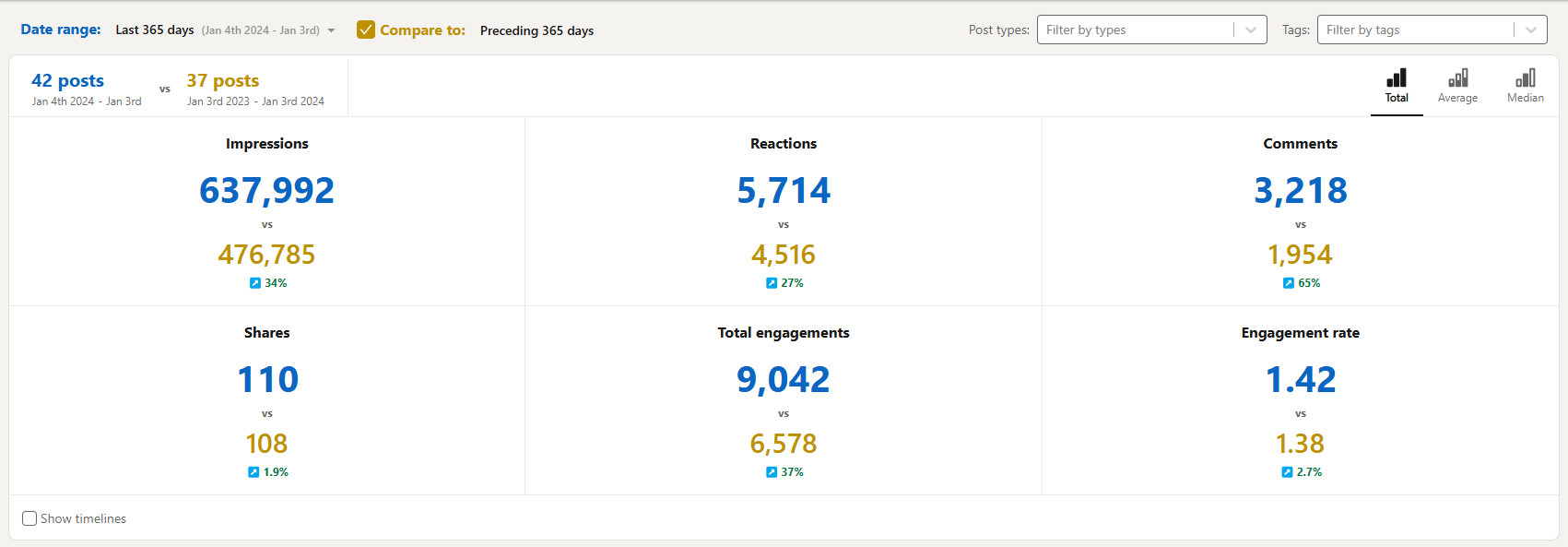
This section provides an overview of your key metrics for a selected time period, with the option to compare them to the previous period:
- The number of LinkedIn posts shared within the chosen time frame.
- The number of impressions within the specified time frame.
- The number of reactions, comments, and shares.
- The total engagement and engagement rate.
New data is displayed in blue, while data from the previous period is shown in yellow.
These metrics are further categorized into total, average, and median values:
- Total: Represents your impact score—the sum of all achievements.
- Average: Serves as a benchmark for typical post performance.
- Median: Indicates the middle ground—the value most likely to represent your next post's performance.

Post highlight section
The Post Highlight section acts as a magnifying glass for your content performance. It enables you to understand how each of your posts performed and allows you to directly compare two posts.

If you pin a post on one graph, it will appear across all three graphs (Growth timeline, Correlation plot, and Reaction timeline). You can dive deeper into each post with detailed statistics, mentions, hashtags, and links.
With a single click, you can open the post on LinkedIn, view it on the AuthoredUp platform, or reuse it.
To see details of a specific post, simply click the Arrow button in the upper-right corner, and the post details will be displayed. From there, you can access additional insights about the post, open it on LinkedIn, or reuse it for future content.

In the AuthoredUp Analytics section, you can directly compare two posts side by side. Pin one post, hover over another, and view the statistics for both in the Post highlight section. This feature allows you to analyze two similar posts to determine why one performed better, helping you apply those insights to future posts.

Interconnected graphs
AuthoredUp Analytics features three interconnected graphs, each providing unique insights to enhance your content strategy.
Growth timeline
The Growth timeline graph visualizes your posts along a specific dimension, measuring the impact of each post published within a selected time period. It helps you track the performance of your posts over time based on various metrics.
The Y-axis dimensions are fully customizable, allowing you to analyze your posts based on impressions, reactions, total engagement, engagement rate, comments, and shares.

Correlation plot
This graph reveals the relationship between two variables for your posts within a defined timeframe.
We’ve predefined several variable pairings to help you analyze their correlation:
- Impressions and Reactions
- Impressions and Comments
- Total Engagements and Readability Index
- Comments and Reactions
- Custom: Create tailored graphs based on your specific needs.
By comparing two variables, you can identify patterns and relationships that might otherwise go unnoticed. These insights empower you to make informed, strategic decisions about your future content.

Reaction timeline
Your audience's reactions to your posts are a valuable source of feedback. The Reaction timeline graph visualizes this data, offering a clear snapshot of your community's sentiment.
Each bar represents a post, with different colors denoting the types of reactions it received, such as likes, loves, insights, and more. This graph helps you understand how your audience feels when interacting with your posts.
By analyzing your audience's reactions, you can quickly gauge the sentiment and engagement levels of your posts. Leverage these insights to craft content that resonates emotionally and drives meaningful engagement.

By default, all reaction types are displayed. You have the flexibility to include or exclude specific reactions based on your preferences—simply click on a reaction type to remove it, and the graph will adjust accordingly.

Posting times
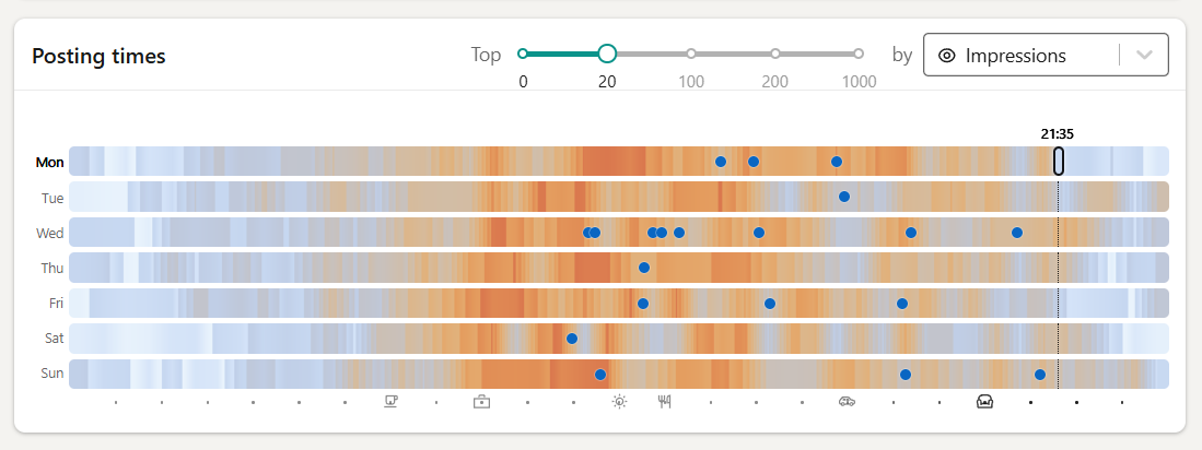
Correlate your actual posts with the best times to post on LinkedIn based on the median engagement and impressions of your content, combined with the scores of creators similar to you.
We will only show a certain number of top posts based on the selected dimension (eg. impressions, reaction count, comment count, etc.). Change how many posts are shown by adjusting the cut-off value. Set to 0 to see just the best times chart.

Word cloud
Understanding the specific words your audience engages with in your posts can significantly enhance your ability to create content that resonates. The Word cloud highlights the words that your audience associates with you and your content, giving you a deeper understanding of the language that drives engagement.
How we generate the Word cloud:
- We identify the language in which your posts are written.
- Common words like "the" or "a," which add little value to the analysis, are filtered out.
- We count how often each meaningful word appears in your text.
The result is a visual representation of word frequency across all posts within your current filter. Words from the current period are displayed in blue, while words from the previous period appear in yellow.
This chart provides an overview of the topics you frequently write about and helps identify opportunities to create more content around specific terms. By doing so, you can ensure your audience associates you with the topics that matter most.

Breakdown chart
Understanding which types of content perform best or which days your posts achieve the most success is essential for driving LinkedIn growth. The Breakdown card provides valuable insights into the effectiveness of your content depending on post type, day and time of posting, post length, and more, with metrics broken down into total, average, and median values.
These insights allow you to determine which content types generate the most impressions, reactions, comments, shares, and other key engagement indicators.
By leveraging this information, you can focus on creating the content that resonate most with your audience and maximize your reach and impact.
Use the tabs at the bottom to toggle between post types, best posting days, the readability breakdown, and more.

Hashtag performance analysis
Hashtags are essential indicators of your content's themes and performance. In the Hashtags section, you’ll find an analysis of all posts within a specified timeframe, highlighting the hashtags used in each post.
This data provides valuable insights into which hashtags — and the topics they represent — resonate most with your audience and drive the best results for your profile.
A detailed table presents the following metrics:
- Hashtag Name
- Frequency of Use
- Comments
- Reactions
- Shares
- Engagement Rate
You can view these metrics as total, average, or median values, giving you flexibility in understanding their impact on your content strategy.

